 People like the idea of having options but when faced with too many they shut down. It’s almost always better to present people with fewer, higher quality, options than to overload them.
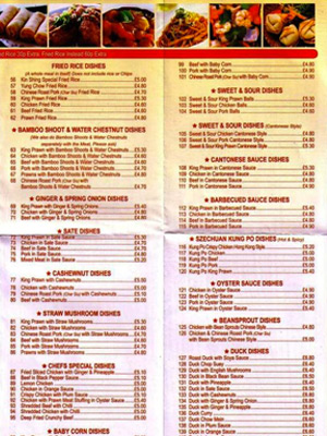
Remember the last time you tried to make a selection from an ten page Chinese restaurant menu? You probably chose something from memory. Back when Blockbuster was in business I had to decide what movie to rent before I arrived because, if I didn't, I'd just wander the aisles in a state of information overload.
Whether you’re sending a client mockups or designing an interface keep the options focused and few. Of course there are exceptions. A power Photoshop user want an array of tools at their fingertips, a pilot wants all their instruments in view. But if you’re designing for the mainstream and want to facilitate decision-making present fewer options that represent your recommendations.